data exploration
The first part of the investigation was to reduce complexity aiming to find groups that could be analyzed together. Using the climate variable from table 2, we ran a PCA color coded by species (Figure 5). We hypothesized that since species occupy different niches we would expect to have some separation of groups according to species. However, although the PCA explained around 82% of the variability in the data, it revealed a great overlap among species separating only J. australis, from the remaining species. Some species (5) were collected in only a few sites and don’t have enough variability captured to form an ellipsis. On the other hand, we could see that the variables MAP, MAT, AHM and CMD are the most important ones for the variability in the data.
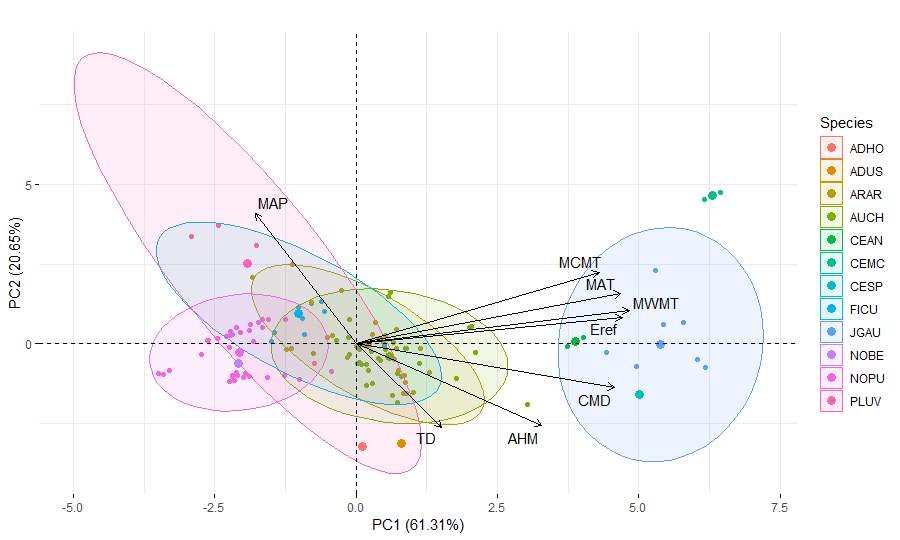
Figure 5. Principal components analysis color coded by species. Ellipsis shows the range of variability of each site. Note how they overlap for most species indicating similar ecological range. Only J. australis separates from the remaining. A. horrida, A. uspallatensis, C. Microchaete, Cedrela spp., C. Angustifolia were collected in few location and don’t have enough variability for ellipsis.
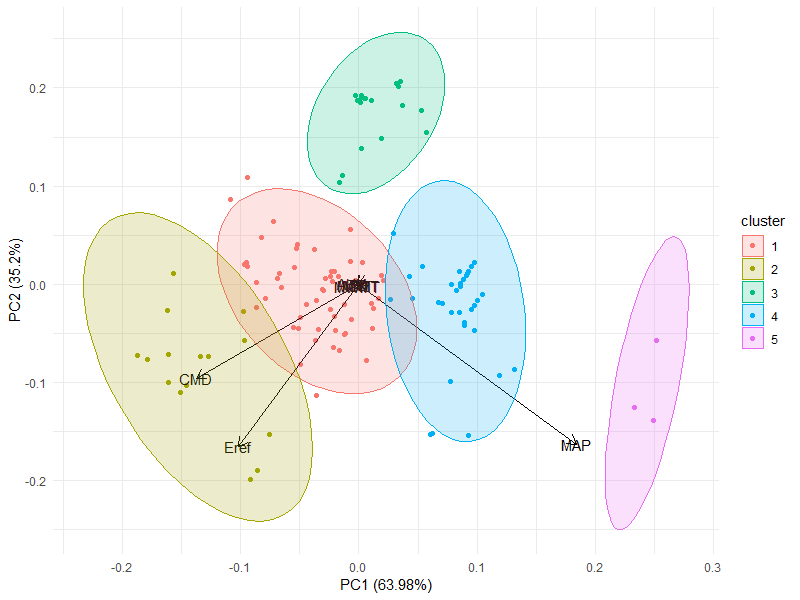
Since they occur throughout a wide range of latitudes, we then hypothesized that trees would be more similar across regions that shared similar climate conditions. To investigate that hypothesis we used the clustering technique Partition Around Medoids (PAM) to group points based on a similarity/dissimilarity matrix using Euclidean distance (Figure 6). This function is a more robust version of k-mean function. It has the advantage of not randomly selecting medoids starting points, what may yield different clustering configurations depending on where it started. Instead, it uses the data points as anchors for medoids. This function requires you to input the number of cluster desired. We tested several options and chose the one with least overlap between different groups. The silhouette analysis also showed the highest silhouette width average at five clusters (Figure 7).
|
|
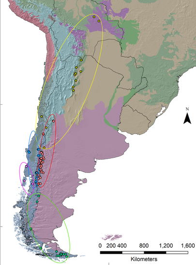
Figure 6. Clustering of data produced by the Partitioning Around Medoids function and their respective classification in the map showed in figure 4. The discriminant analysis in this function explained approximately 99% of the variation with mostly three variables (MAP, Eref and CMD). Five groups are clearly distinct with little overlap between them. Points in the map were classified following the PAM results and the circles around them show how groups are distributed. Notice how they group geographically supporting the cluster analysis.
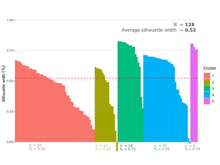
Figure 7. Silhouette plot produced by the PAM function demonstrating the separation of the groups. Bars indicate the average silhouette width of a single point to all other points in the PCA. It describes how different that point is from the nearest group. High positive values mean that the point is well categorized within that group. Negative values represent poorly categorize points (could belong to different groups). Dashed line represent the average silhouette width among all points. Since one site can have multiple chronologies the sample number here refer to single coordinates.
After the clustering analysis, the points were replotted in the map to add context to the data. As seen in Figure 8 the clusters converge to similar geographic locations as expected. As verified in the PCA from figure 6, the costal cluster 5 has highest MAP, followed by cluster 4 that is more inland but still close to the coast, then clusters 1 and 2 to east of the cordilleras and finally cluster 3 to the very south of the Patagonia.
All chronologies were then plotted to visualize potential error in data import and to investigate different growth patterns (Figure 8). Species composition vary among different regions and some species seems to have experience anomalies in growth, e.g. Cedrela spp. in region 2, Nothofagus betuloides in region 3 and Austrocedrus chilensis in region 1. These might be candidates for further investigations on possible drought events or any other possible cause for such anomalies.
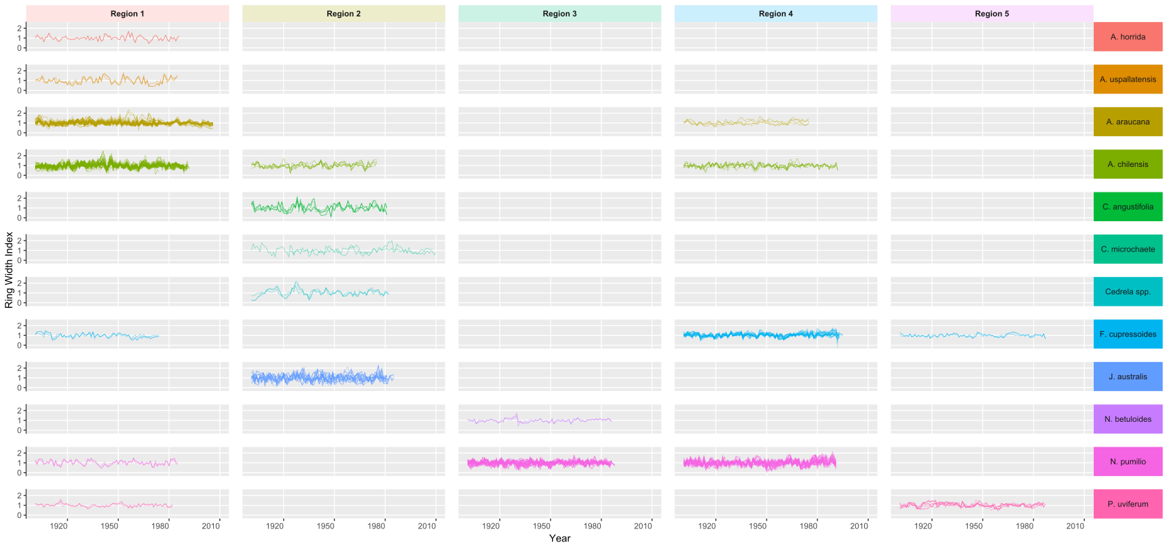
Figure 8. Ring Width Index as a function of year. Each line represent a single chronology (observation). It is noticeably the different composition of species for each region as well as number of chronologies (denser plots). Some anomalies are observed (e.g. Cedrella spp. for Region 2. 1910-1940) that might be related to climate but overall the data seems to be free of error.
